Overview
This section walks you through the concepts of Chaos dashboard and how you can visualize different aspects of a chaos experiment.
Dashboards help visualize important metrics and data associated with your experiment runs. They help create an at-a-glance summary to understand the behavior of data. They are also used for business analysis to gain actionable insights into data.
Chaos dashboard
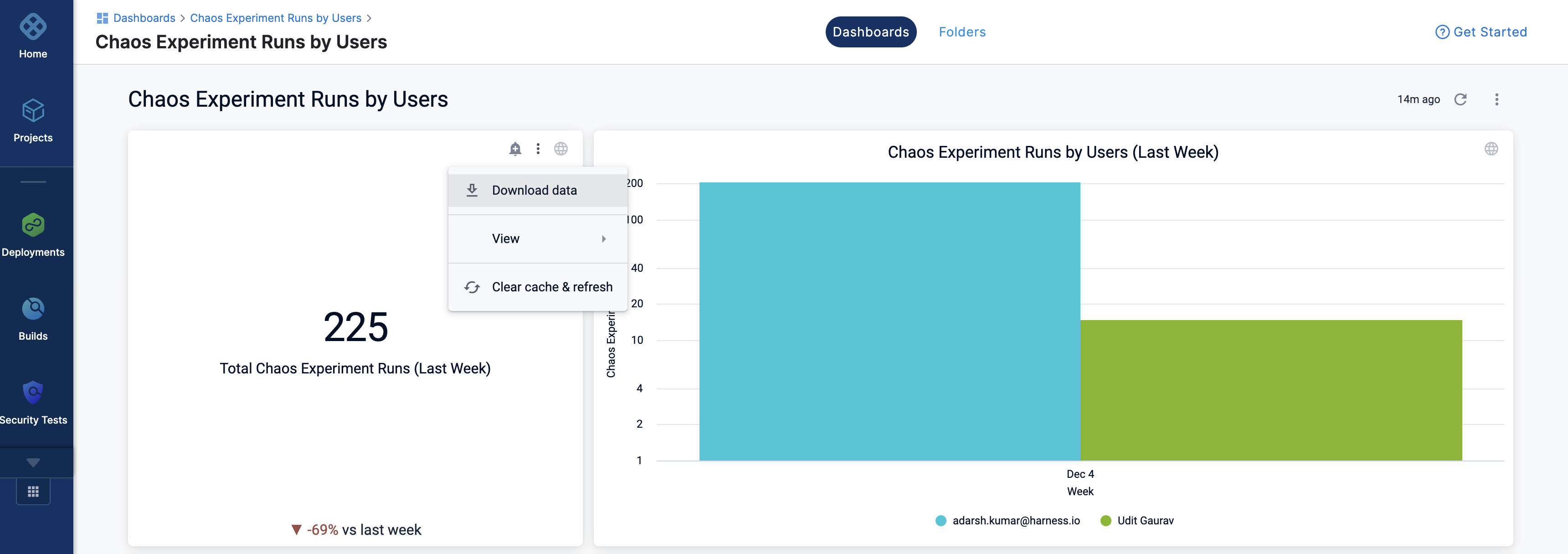
Chaos dashboard is an interactive user interface that manages, visualizes, and monitors chaos experiments. It helps visualize various features associated with a chaos experiment. It provides a visual of entities in the form of a bar graph, along with a tabular representation of the visualized data.
For SAAS, this feature is currently behind the feature flag, CHAOS_DASHBOARD_ENABLED. Contact Harness Support to enable this feature.
Contact your sales representative to check if you are eligible for the on-prem platform.
View a chaos dashboard
To view a chaos dashboard, follow the steps below.
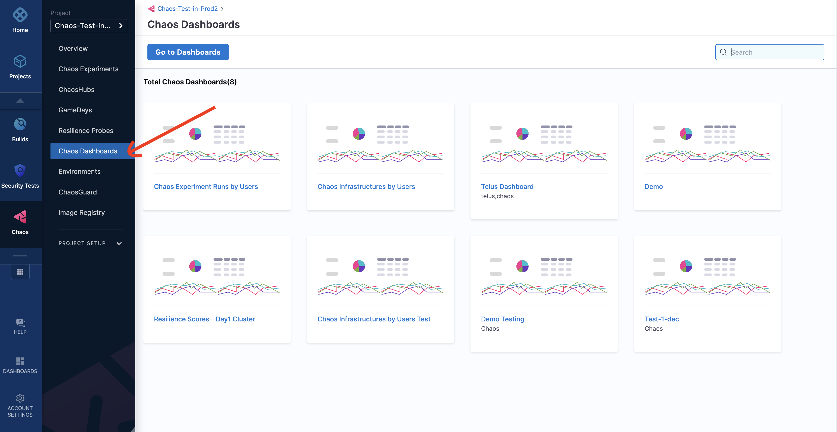
Step 1. Navigate to Chaos Dashboards
- Navigate to Chaos Dashboards.
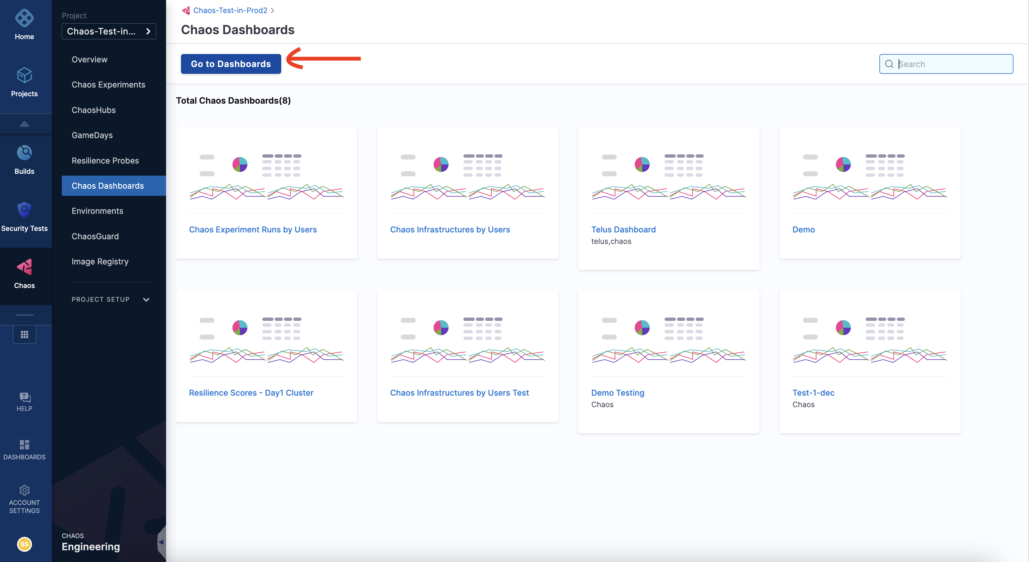
Step 2. Go to Dashboards
- Click Go to Dashboards.
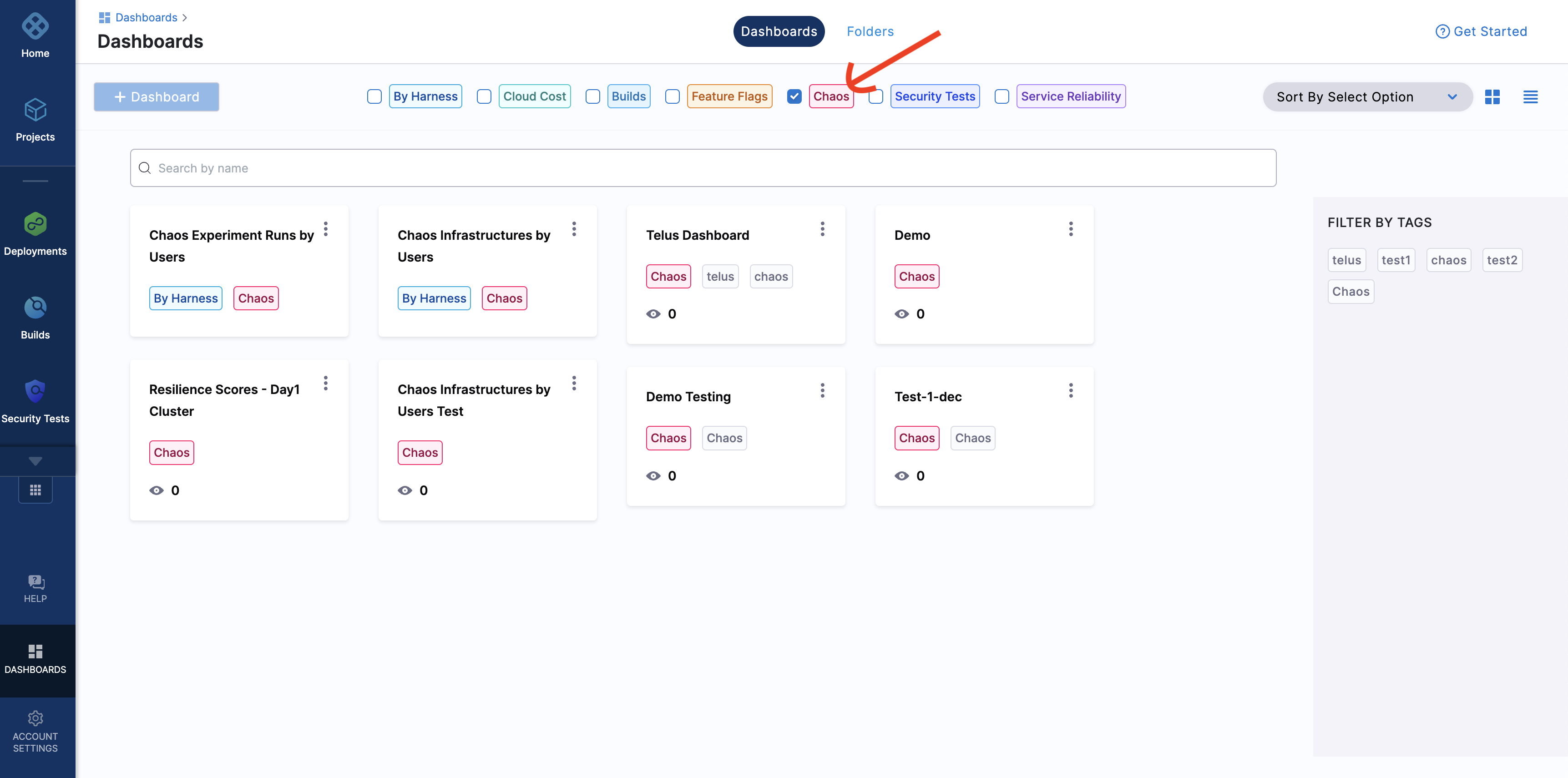
Step 3. Select Chaos from list of modules
- From the modules displayed at the top, select Chaos. You can see a number of predefined chaos dashboards. You can either select one of the experiments or create a new dashboard. Here, you can select a predefined chaos dashboards.
Step 4. Predefined dashboard
- You will see multiple visualizations in this predefined dashboard.
The values represented in the dashboards refer to previous week, month, and year. These visualizations don't consider the ongoing (or current) week, month, or year.
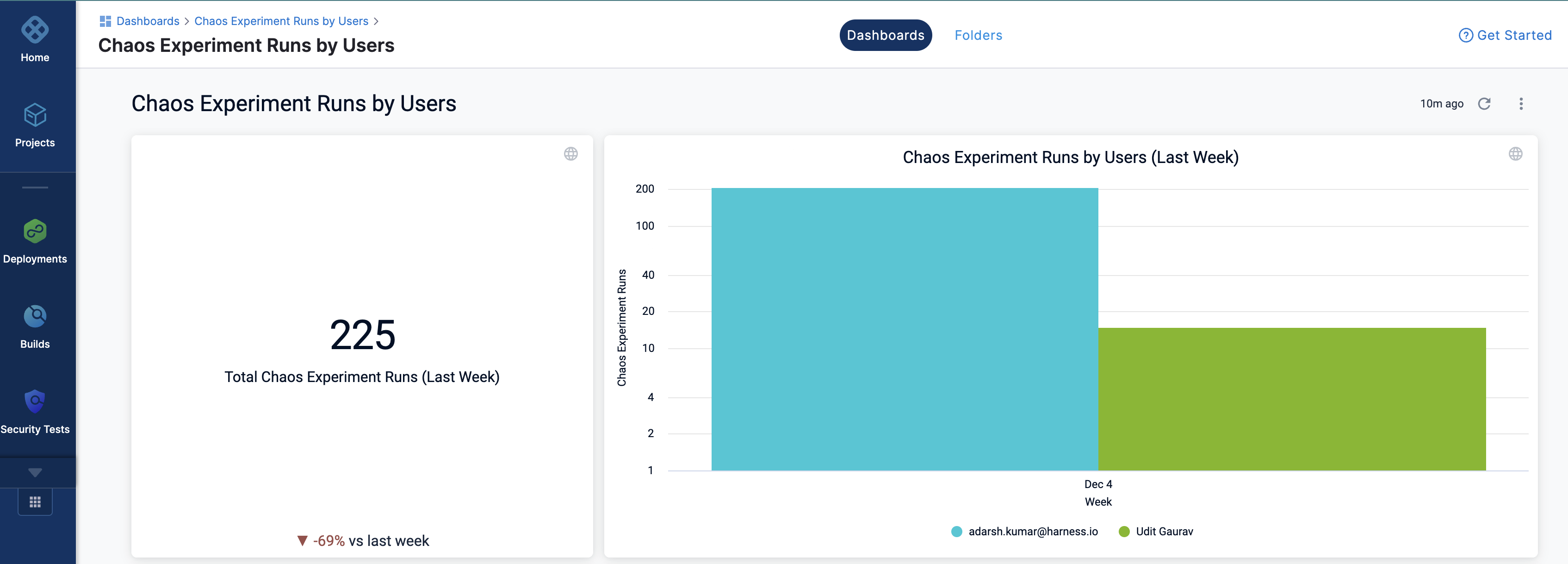


You can view the data, and download the data in different formats (such as JSON, excel, and so on.)
